Overall vogue is a well known magazine aimed towards fashion and mostly aimed at women. With hundreds of thousands of copies printed. Giving different people ideas on styles. This may be with the use of famous people to interest them


These can show how a lot of these magazines are based on women's fashion, with often quite light colours for the cover. Although it is targeted for women there are also magazines with well known men as well.
Case study 1- Raheem Sterling GQ Tuesday 12 November 2024
It targets men by showing that they are wealthy and masculine and have a high profession compared to women to make them feel masculine and powerful, satisfy their male audience.
GQ represents gender by by showing only women as sexual by having men shown as superior and more professional then the women to have only men that are interested as it is showing women as a low profession and just used for looks or sexual.
Do now Tuesday 19th November 2024
1. Conde Nast ✔
2. ABC1 ✔
3. around 20-44 ✔
4. masthead ✔
5. a colour palette is the variation of colours used in a design
media language
- cover star
- masthead
- cover lines
- anchorage text - any text that is used to anchor an image
- lexis - the words used
- typography- how the words look
- brand identity
- image
- colour palette
typography, weather it is a serf font or sans serf font
- style
- block capitals/lower case
- colour
- bold/Italics
The magazine uses block capitals for the masthead to make it stand out to their audience. Using a sans serf font indicating that it is a masculine magazine to sense it is more serious. The more important cover lines have been put in bold. The colour palette of white and beige colour as they are seen as quite light colours compared to the image and background.
Colour palette
The colour palette on the magazine are beige and white. These are used because it can be seen as quite masculine colours to interest their target audience. Beige is often seen as a wealthy colour Rather than having a lot of bright colours. The colours mostly are from the main image.
Layout
They have have not used a L or Z pattern as the cover lines do not go across the image but around it.
anchorage text
the main cover line is "rock and roll" which could indicate that he is is a band. This can be seen as he is wearing shades which could be within his style.
image
The image is a mid shot type to show what he is wearing whilst focusing on his face. Using direct address to make it look serious. It looks like he is wearing quite wealthy clothes it has a golden button with a good pair of sun glasses to make him seem cool.
Cover lines and lexis
It mentions things that will target their audience by including football, fashion, class and much more. This is because they are often mens interests or what they focus on.
Do now. Tuesday 26th November 2024
1. an anchorage is the main cover line ✔
2. the style, block capitals/lower case, colour ✔
3. cover lines ✔
4. sans serif ✔
5. Medium close up ✔
facts about Raheem sterling before 2019
- he has been in many well known football clubs in England
- was born on 8 December 1994 kingston Jamaica
- his religion is Islamic faith
- he was originally from Jamaica but now in the UK
- he is 29
- His mother was an athlete for the Jamaican national athletics team
- high end football since he was 17
Raheem sterling is a skilled footballer who came from Jamaica. He has played for many well known football teams in the Uk, this all went well until 2018 at a Chelsea match. This was where he had been receiving racial slurs during one of his matches. He spoke out about racism and that is how he ended up on the cover of GQ in 2019.
masthead- GQ in a bold large serif sans font, which is a dark gold along with the main cover line
cover lines- "speak no evil inside the most brutal dictatorship you've ever heard of" in a white and orange colour. This could show how he feels and have experience racism.
Anchorage text- The main cover line is "guardian angel" this can be shown to anchor the image, this is because he is wearing wings like an angel would.
layout- the cover lines form to make an 0 shape around allowing it to stand out as well as the image.
image- the camera shot is a long shot, he is wearing black trousers and wings. This can link to the main cover line " guardian angel" Although typically angels have white wings so this could challenge stereotypes or challenging racism
Typography- the majority of the text used are in bold fonts, using all san serif apart from the main cover line which is serif.
Lexis- some of the words that was used (brutal, evil, insane, wild, nightmare) these words can be used.
Do now Tuesday 3rd December 2024
1. He is a footballer ✔
2. by looking at the font, if its bold and the colour ✔
3. racism ✔
4. serif ✔
5. anchorage text✔
Do now Tuesday 10th December 2024
1. Cover lines show what the magazine is about ✔
2. A magazine cover is to interest people ✔
3. Racism✔
4. the camera is facing up ✔
5. Convention is the way in which something is normally done.
Assessment improvement
non verbal codes- mise en scene
written codes- anything written
gesture codes- body language
symbolic codes
narrative
colour palette
The main image shows a low angle shot Sterling standing in a confident stance with a large pair of black wings to challenge the issue of racism and showing his power by using the low angle shot being represented as an angel. He is looking at the camera with a serious face to represent the importance of this topic by directly addressing the audience. This is done as it can represent the issue of racism as describing his black wings.
C- layout and design
The text around the image is in the shape of a Z. The text has been placed around the main image as it will show the importance of the image. The main colours on this magazine were gold, white, black with a small amount of orange which could contrast with racism and wealth. The masthead GQ being in a bold gold font showing its importance. Some text being in orange to make it stand out as the image is more of a darker colour. Most of the other cover lines have been in black and white as this can resemble racism. The more important information being in a larger font size to make it seem more important for the reader to look at.
Do now Tuesday 17th December 2024
1. another word for connotes is annotate ✔
2. The wings can show how he is being described as an angel ✔
3. GQ target audience is men aged (20-44) within ABC1 ✔
4. The purpose of a magazine cover is to interest others in what the magazine is about ✔
5. The media convention is the way in which something is usually done.
GQ Representation
Gender
- shown as masculine
- his muscles are showing
- he's got a wide stance
- he has jewellery representing wealth and success
- him being shirtless showing his tattoos
- wings seen as supernatural/ represent his skills
- the low angle shot, to seem confident
- all people named on cover being successful
- modern men are expected to "have it all"
- masculine topics on cover lines
Ethnicity
- his tattoos could challenge stereotype
- not typical that a black man is on a magazine
- he is shown as powerful as a black person, supports stereotypes
- wings links to him being protective and an angel
- goes against the stereotype of black people being violence
- using a successful British Jamaican as a role model to others
- going against how often they are criminals compared to white people
- wide range of diversity in ethnicities
Do now Tuesday 7th January 2025
1. the genre of vouge is lifestyle and fashion ✔
2. vouges target audience is ABC1 ✔
3. Conde nast ✔
4. the magazine cover is to interest people into buying ✔
5. a young women that is skinny ✔ white, model or celebrity
case study 2- vogue
In the past vogue did not include different ethnicities on their covers. This is as they believed that others would affect sales. The newer covers show a diversity of races, ages and gender. This tells us that vogue has change to understand that the magazine can still be good no matter the age, size, race or gender accepting variety of people.
malala Yousafzai
- she is 27 years old
- she been shot by the Taliban in the head
- became an international symbol of the right of girls education
- she opened a school for Syrian refugee girls
- made a book about her story
- first speech about rights at 11 years old
- from Pakistan
- survived and had full mental capacity
- won a Nobel peace prize in 2014
Malala was known for being shot in the head by the Taliban but survived. This was because of her actions fighting for women's rights and education at the time know ad an education activist from Pakistan where women was mistreated and believed to not deserve education.Showing that even in the worse situations it can lead to big changes. I think that she has been put on the cover of vogues magazine to represent the power women can have an inspire others, as the target audience for vogue is ABC1 women meaning this could be targeted to their audience. At the age of 17 she had been rewarded the Nobel peace prize.
do now Tuesday 14th January 2025
1. for being shot and surviving ✔
2. ? june 2011- Us and Uk troops planning to leave Afghanistan
3. vogues target audience is ABC1 ✔
4. no ✔
5. no ✔
Media language analysis
vogue masthead
- serif font (didot)
- it shoes that it could be fancy, classic, stylistic
- vogue means the prevailing fashion or style at a particular time.
- block capitals connotes that it is to make it more stand out
- the masthead is on top of her head which can show that she is a vogue role model despite it usually being around the covers model
- it is silver to show how she is a model as silver/grey can be seen as a colour of wealth
anchorage text
(main cover line)
- the brightest text is Malala, as this is the cover stars name and could show the importance
- this is describing her as a brave person who has been through a lot and should be inspired by. It is the same colour as the masthead showing its importance
- the main cover line shows importance as it is in a bold serif font.
layout
- in a Z shape, a typical magazine cover
cover lines
- the cover lines have a pattern in colours, black then white
- in capitals and in a serif font, a lower case in sans serif in italics
- the text contrast with the bright red background, making it stand out
- mentions thing such as fighting but also love after lockdown which is an alliteration
- unusual cover lines, to try inspire them and broaden the users appeal
image
- mid shot type
- she is wearing a bright red dupatta which could either show love or violence and blood which could show how she has been through horrors and still made it alive
- confident face expression
- her hijab can represent religions
- expensive looking clothes
- her hand on her face to adjust the viewers eyes
- looking into the camera
- her rings could show wealth
Do Now Tuesday 21st January 2025
1. the shape Z ✔
2. Anthony Joshua is a famous boxer
3. mid shot / medium close up ✔
4. the way to describe a model looking into a camera is direct address
5. it can represent violence and blood. passion, power high status, love
cover analysis
In this image it represents Malala as a confident women. This image is a medium close up because it will show us her expensive looking outfit as well as her face and the jewellery that is on her hand. The colour red can connote that she has a lot of wealth and has high status as red can be seen as a luxury colour. The mid shot was also used for people to know how she is wearing a hijab as it Vogue had never had a variety of people.
. The Anchorage says "survivor, activist, legend". This can show us how Malala is a brave women and it determined. As she had once survived being shot in the head this could consider her as a legend. This text is in a server colour as it could represent wealth and success It is the same colour as the masthead to show its importance. As well as her name "Malala" being in a bold font to make it stand out.
The cover lines are in a black and white colour to make each one stand out. with words such as " fighting, lockdown, love, dating'. This may suggest that there is a mixture of themes within the magazine. These are in bold and italics as it could highlight is what is or isn't important. This is unusual as vogue is mostly a feminine magazine company so adding things about boxers and fighting can show how it is different.
Lastly, the layout is stereotypical and follows magazine cover conventions. This is as it is using the Z shape to position the cover lines. This is because that is the usual way people would read a magazine.
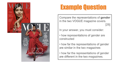
Exam question- images
The main image shows a young women, they have used direct address to show how she is confident. The shot type used is a medium close up. This could be done to show Malala's jewellery as well as her outfit. This may stick out as she is wearing a hijab despite vogue being very limited to who is on their covers. Her hands being next to her face could show her rings to tell us she has wealth. Her hijab is in a bright red colour. This could be to represent love and peace as well as wealth. Red can be seen as an expensive colour, this would matter as the target audience of vogue is ABC1 which are quite wealthy.
Do now Tuesday 28th January 2025
1. the way that something is shown ✔
2. what you can see if its positive or negative
3. Muslim ✔
4. No ✔
5. the colour red could show peace and love, passion, power, high status
Representation
In the past Muslims have been represented as largely seen or shown as a certain type of person, often seen for their acts of terrorism. They are seen as anything but.
In terms of ethnicity the vogue cover has a diversity of races.
There are both genders shown in the magazine despite it being targeted for women, including themes of love, fighting, summer beauty. It is against stereotypes in a positive way.
Explain how both ethnicity and gender have been represented on this cover.
In this cover the use of ethnicity has been used in a diverse way. This is because they have a Muslim as their cover star and two black representatives within the cover line. It is unusual to see someone wearing a hijab in a magazine especially the cover star . Typically vogue magazines used to only include white women and females, which challenges the stereotypical magazine cover.
In this magazine cover it shows women in a stereotypical way. This is as some cover lines mention themes like love, fashion and beauty. Typically these are the themes that are uses in women's magazine as it is what most women are known to like. These do support the stereotypes of a typical women's vogue magazines as they often have similar or the same topics in their magazines.
This magazine cover also challenges stereotypes. This is because one of the cover lines mentions a male boxer which is unusual as it is often as the magazines are usually meant for women and their stereotypical themes. In one of the cover lines it mentions fighting. This challenges the stereotypes as women aren't often seen to like things like fighting, as most topics are light hearted like fashion and relationships.
do now Tuesday 4th February 2025
1. they used to have a lack of diversity ✔
2. "fighting talk"✔
3. as a confident woman ✔
4. as brave ✔
5. they had been seen as male and terrorists✔
comparing
Similarities
- they are both wearing red to show strength and power
- their both confidence
- how there is diversity in the covers
- intelegent
- more than stereotypical cover lines
- strong
- feminine outfits
- red lipstick to show them as feminine
- both have a flow and silky material
- seen as wealthy as shown with the jewellery and outfits
- first name only to show their high status and knowing who they are
Differences
- their pose
- long shot to show the outfit and her whole body
- medium close up shot to show her and how she is
- the style of their clothes
- the topics, one about politics and the other about fighting an bravery
- their ethnicity, race
- Lizzo cover more bold and wanting to stand out
Do now Tuesday 11th February 2025
1. similarities and differences ✔
2. how much something is✔
3. around 5 ✔
4. with one that you had been learning✔
5. imagery, cover lines, language
25 mark question
similarities
- confident theme
- cover lines a similar colour
- made to look feminine
- a conventional magazine cover
Differences
- they are wearing different style clothes
- different colour palettes
- one is giving direct address, the other isn't
- one stereotypical one less stereotypical
- the way they are positioned/ posing
There are more differences than similarities.
The representation of these two covers are overall different. As the vogue cover is made to make Malala look powerful and elegant. whereas on the Elle cover it is aimed for Kim to look sexy and beautiful.
Within these magazine covers the way that they have been dressed is completely different. In the vogue cover she is wearing a bright red Hijab as it is part of her religion, covering all but her face and hands. Showing Malala as quite wealthy and feminine. Which can connote that she is representing her religion rather than a stereotypical cover star. However in the Elle, the cover star is wearing a loose top with no trousers, this could show her body more to make her look more sexy and attractive.
In the magazine covers the way that the cover stars are posing are different. In the vogue cover you can only see her hand lightly touching her face which could show peace and beauty. This could show her as a calm person. She is also shown to be looking into the camera which can show confidence in the way that direct address is used. Whereas in the Elle cover, Kim has been shown to be posing with her arms and legs out. This could give a sense that she is confident about her body. She is not giving direct address but looking confidently towards something.
For these magazines the representation of the cover lines are different. This is shown as in the vogue cover lines you can see the topics of things such as fighting as well as love and fashion. in which fighting isn't a stereotypical theme for a magazine. These cover lines could inspire women to feel confident and powerful In the Elle magazine the cover lines are about beauty and fashion. This is the stereotypical topics for a women's magazine.
The magazines are similar based on how they are made to look feminine. As seen in the vogue cover you can see her wearing jewellery which is stereotypically something that women like to wear which can also connote that she has wealth and status. Whereas in the Elle cover she is also shown as feminine as she has been seen to have her nails done and wearing an expensive looking belt which could show her passion for fashion as a woman typically focuses on how they dress.
Overall the two magazine covers have been seen as different.This is as one had been shown to look attractive and hot whereas the other cover has been made to look beautiful and confident. The similarities are only based of magazine conventions and how women are made to look feminine.
Dirt Tuesday 4th march 2025
25 MARK COMPARISON Q: 17/25 Good work!
WWW: you’ve clearly identified differences and analysed them
EBI: include the connotations
TARGET 1: Add more detail to your answer
DIRT: Add in the connotations of the details you’ve identified.
Assessment dirt Tuesday 1st April 2025
question one
5 mark question = 2 points
Q1 C
The layout of this magazine follows the typical use for layout which is the Z shape, which is the stereotypical magazine layout. This allows the image to be the main focus as well as the cover lines catching out. On this cover the colours white, black and grey have been used to contrast with the image. This colour palette could suggest wealth and luxury, The red in this magazine connote power and control. For example, putting the main cover line as white stands out the most.
question 2a
social context= what was going on in society at the time the text was written.
to add-
Malala was an importance to be on a magazine is to show current issues. This is things like worries of the Taliban taking over what women had been fighting for a long time. In which this will spread awareness of what is happening in other places, giving an up to date information that they might not of known without seeing the magazine.
Question 2b
Ethnicity is a characterisation of people based on having a shared culture. (race)


Good notes.
ReplyDeleteREPRESENTATION TASK: Great cover, clearly showing an understanding of representation.
COMPARISON TASK: A great first attempt. Some clear comparison supported by reference to the two texts.
INDUSTRY RESEARCH: Good notes
GQ COVER ANALYSIS: Great work!
WWW: You’ve clearly analysed elements of media language
EBI: make sure you include detailed reference to the cover with connotations
VOGUE COVER ANALYSIS: Brilliant – much better!
WWW: You’ve clearly analysed elements of media language using connotations
EBI: try including CONVENTIONS
25 MARK COMPARISON Q: 17/25 Good work!
WWW: you’ve clearly identified differences and analysed them
EBI: include the connotations
TARGET 1: Add more detail to your answer
DIRT: Add in the connotations of the details you’ve identified.